Eight years is a significant milestone for any business. It is long enough to grow, to evolve, and to develop a much clearer sense of who you are, what you stand for, and the kind of work you want to be known for. For us, it felt like exactly the right moment to make sure our brand reflected all of that.
We have always been proud of what we do. But over the years, as our design style matured and our understanding of what our clients truly need deepened, we began to feel that our brand identity was no longer keeping pace with the business we had built. We loved our previous branding, it served us well and got us to where we are, but we knew, instinctively, that it was time for something new.
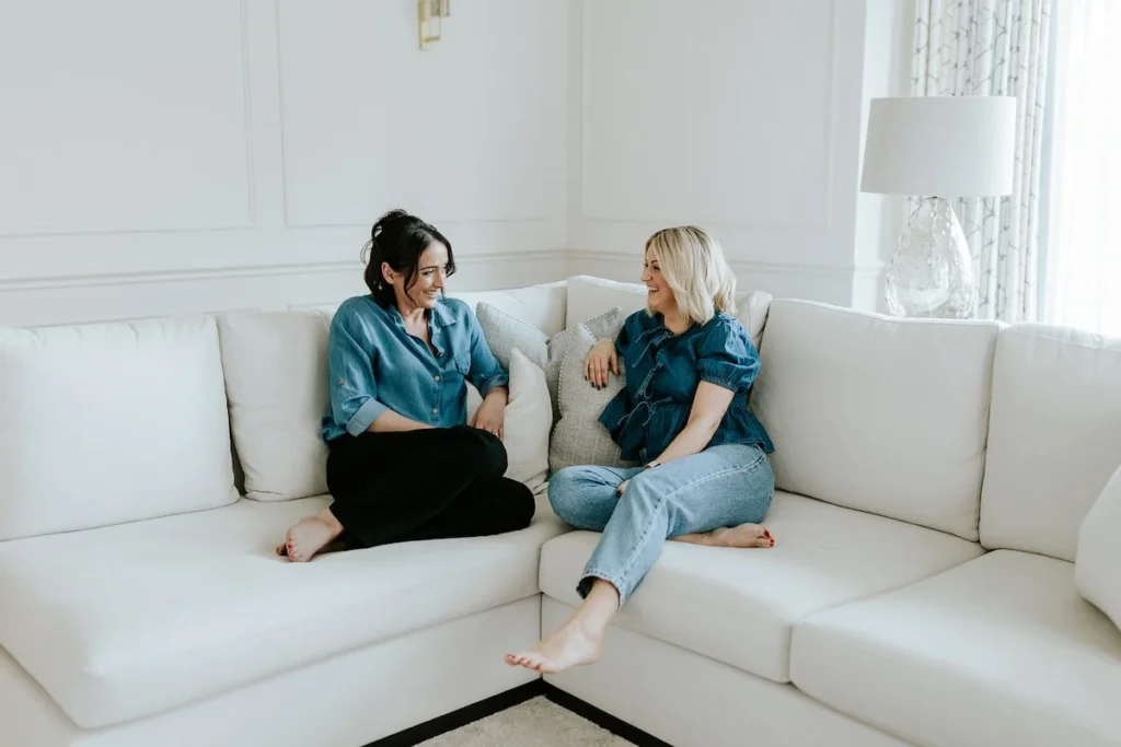
What was missing
It was not one single thing. It was more of a gradual realisation that the visual identity we had was no longer a true reflection of our aesthetic, our values, or the direction we were heading. Our design work had evolved considerably over the years, becoming more refined, more architecturally considered, more intentional, and we wanted a brand that communicated that same sense of quiet confidence.
We also wanted consistency. Not just in how the brand looked, but in how it felt across every single client touchpoint, from the first email a potential client receives, through to the welcome guide, the fee proposal, the design presentation, and the final handover pack. As a studio that prides itself on attention to detail, it felt important that every part of the client experience reflected the same level of care that goes into our interiors.
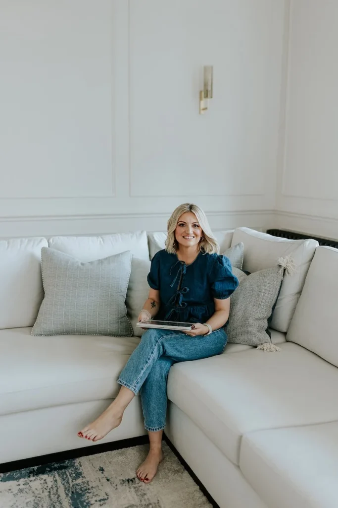
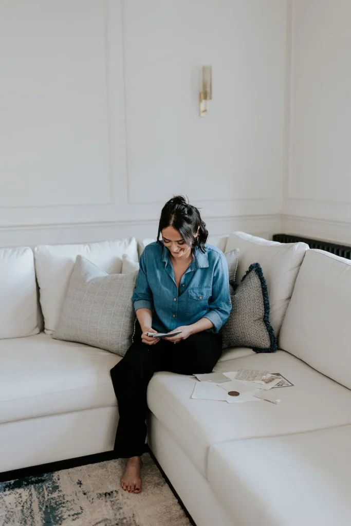
The process
After some research, we found ourselves working with The Brand Muse, a full service creative studio who we trusted to take us through the process from start to finish. And what surprised us most was the depth of strategic thinking involved before any design decisions were made. Working through our brand strategy, defining our values, our tone of voice, our positioning in the market, and the experience we want every client to have, gave us a level of clarity about our business that we had not anticipated.
It was, in many ways, as much about understanding ourselves as it was about creating something new. Putting words to what Wells and Maguire stands for, articulating who our ideal clients are and what they need from us, and defining how we want to communicate, all of that work gave us a foundation that felt genuinely solid.
What we had not fully appreciated until we were in it was just how much thought goes into the decisions that might appear straightforward from the outside. Choosing our colour palette, our typography, the details that would carry our brand across every touchpoint, these were not quick decisions. We found ourselves genuinely in our clients’ shoes, weighing options carefully, considering how each choice would feel across different contexts, and understanding first-hand why that level of consideration takes the time that it does. It gave us a new appreciation for the process our own clients go through when they trust us with their homes.
From there, watching the identity take shape was exciting. Seeing the colour palette, the typography, and the logo suite come together, and recognising ourselves within them, made the whole process feel meaningful. This was not a cosmetic exercise. It was a considered, strategic decision that we are already glad we made.
A brand that finally fits
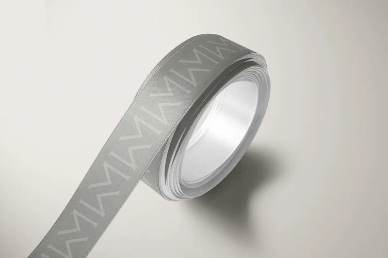
The new Wells and Maguire brand feels like a true reflection of who we are today. The colours are drawn from the natural, layered world of the interiors we create. The typography balances elegance with warmth. And the overall identity, from the logo suite to the brand marks to the tone of voice that runs through everything, communicates the studio we have spent eight years building.
We hope you love it as much as we do.