Luxury paint colours have the ability to completely transform the feeling of a home. Beyond simply adding colour, the tones we choose help shape the atmosphere of a space, creating warmth, calmness, sophistication and depth. When designing interiors, we always consider how paint will work alongside natural light, architectural details, materials and joinery to ensure each room feels cohesive and timeless. Often the most luxurious interiors are not those filled with bold statements but those where the palette feels effortless, layered and considered.
TIMELESS PAINT COLOURS
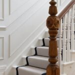
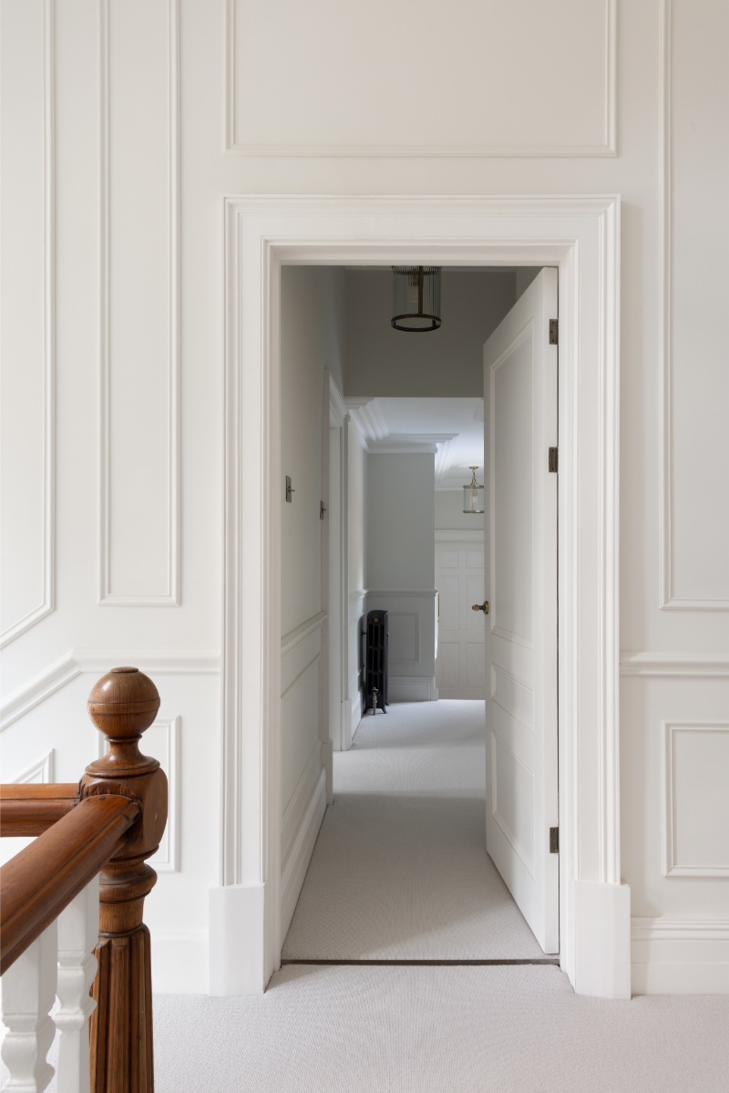
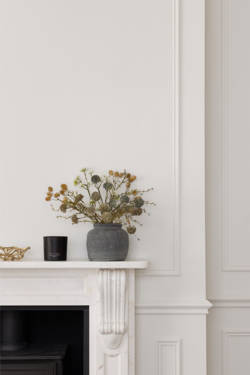
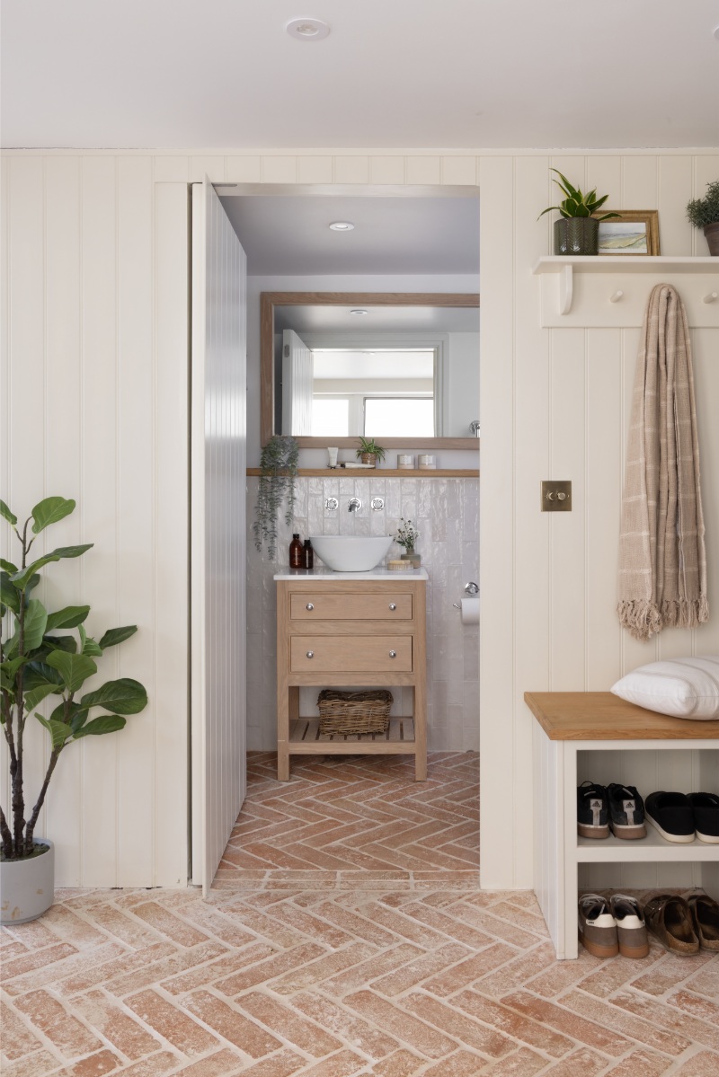
At our South Wales renovation project, we carefully selected warm off-whites throughout the home to celebrate the beautiful Victorian features and original detailing. Rather than competing with the character of the property, the softer neutral palette allowed the intricate cornicing, panelling and fireplaces to become the focus. The warmth within the paint tones also helped soften the natural light, creating spaces that felt elegant yet welcoming – avoiding the starkness that cooler whites can often bring to period homes. We used Slaked Lime Mid 149 to all the main areas of the home, a soft but warm off-white.
CONTEMPORARY PAINT COLOURS
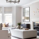
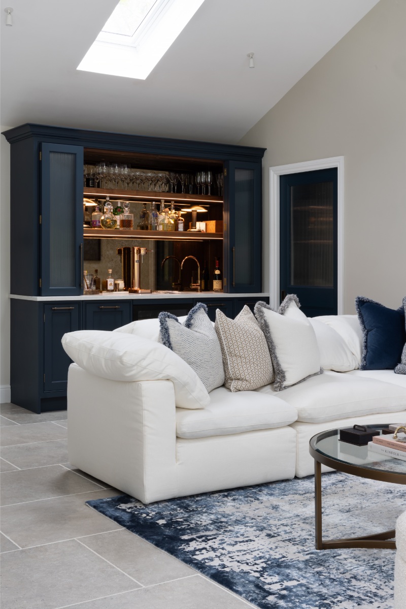
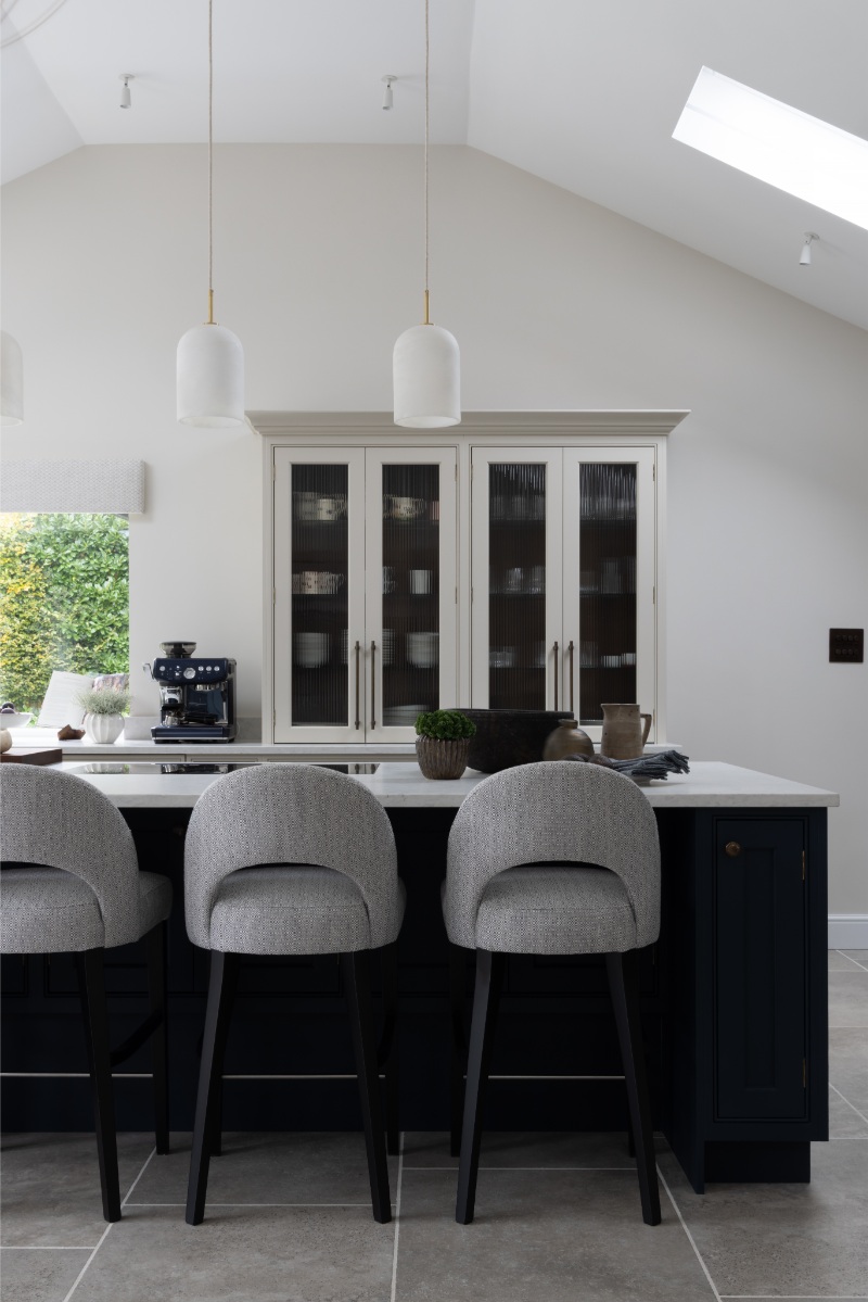
For our Haslemere project, the approach was slightly more contemporary. Here, we layered warm neutral wall colours with deeper, richer tones on the joinery to create contrast and definition throughout the home. The darker cabinetry and bespoke detailing added a sense of sophistication and grounding to the lighter spaces, whilst still maintaining an overall warmth to the palette. We often find that introducing darker colours through joinery is a beautiful way to add depth without overwhelming a room. We used a colour combination in this home of Hague Blue 30 and Portland Stone 77 on the kitchen cabinetry, utilising a more muted tone on the walls in Portland Stone Pale 155.
COMFORTING PAINT COLOURS
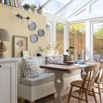
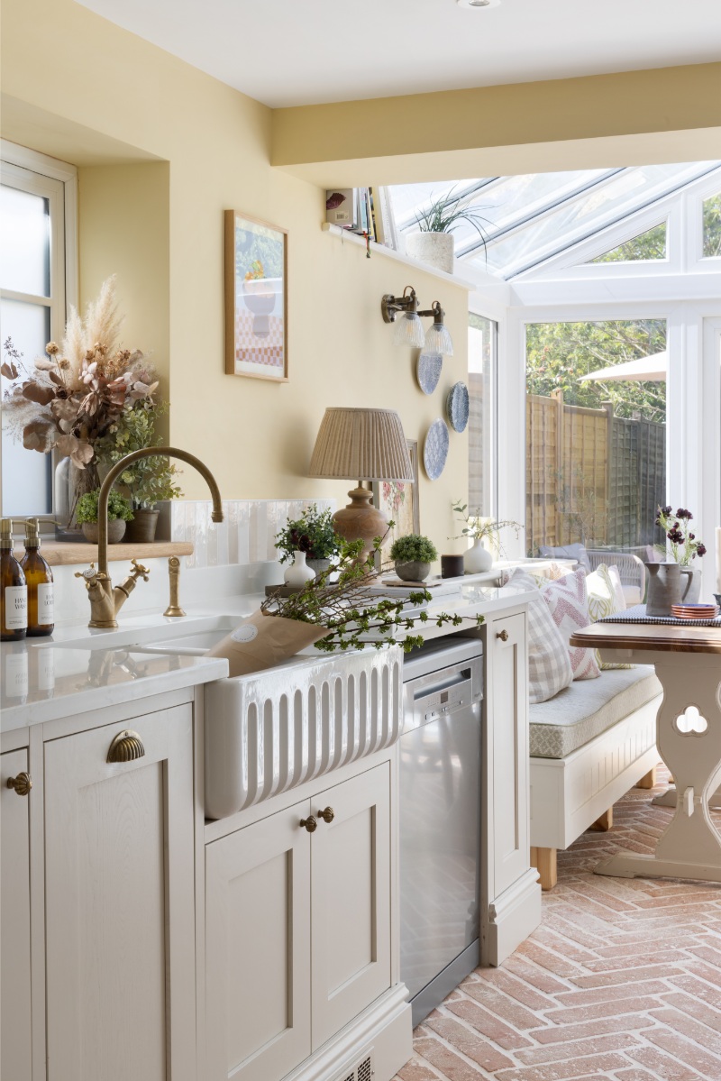
Within our Surrey cottage project we leaned into muted yellows, soft creams and earthy tones to create a home that felt cosy and comforting. The cottage setting naturally lent itself to a softer, more cocooning palette and we wanted each room to feel calm, layered and inviting. These warmer tones, such as Hay 37 on the kitchen walls and School House White 291 for the hallway panelling, worked beautifully alongside the natural textures and traditional elements throughout the property, helping the interiors feel settled and timeless.
ADDING COLOUR
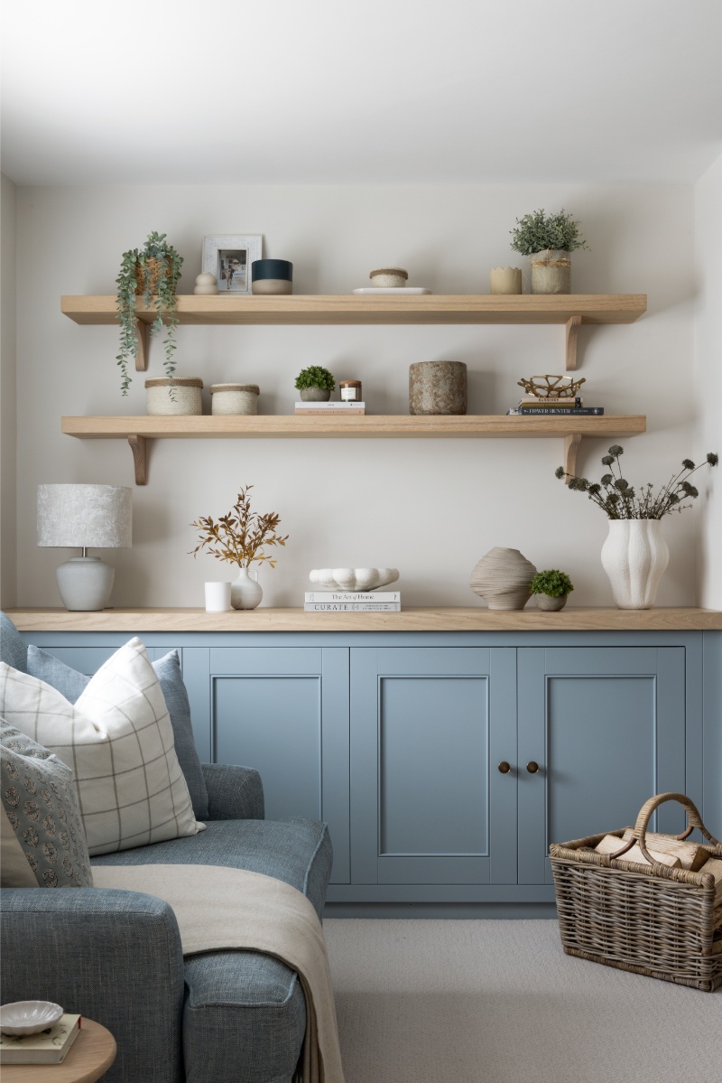
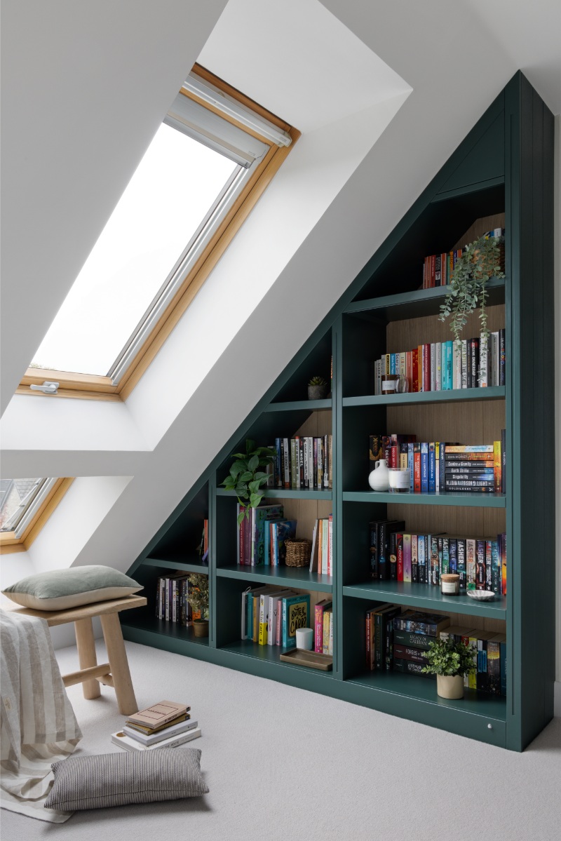
At our Bristol project, we explored a slightly more playful use of colour by pairing warm neutral backdrops with a mix of pastel and bolder tones across the joinery and fitted elements. The softer colours in the living room brought personality and charm to the spaces whilst still feeling refined and balanced. We loved how the colourful joinery added subtle moments of interest throughout the home, particularly when combined with warmer paint colours and natural materials. In the living room we paired the soft Bone China 107 of the joinery with Slaked Lime Mid 149 on the walls. In the library bookcase area of the landing we paired the bold Three Farm Green 306 on the bookcase with a softer tonal variant Slaked Lime 105 on the walls.
When selecting paint colours for any project, we always consider how the palette will evolve throughout the day as the light changes, as well as how each room connects to the next. Creating flow throughout a home is incredibly important to us, and often it is the quieter, more tonal palettes that create the most luxurious and timeless interiors.
As always, if you have an interior project in mind please don’t hesitate to get in touch. Have a lovely weekend and we look forward to welcoming you back next month.