Neutrals have always been the backbone of refined interior design. But the neutrals we are reaching for have shifted, and if you have found yourself drawn to warmer, earthier tones recently, you are not alone, and you are not following a trend. You are responding to something far more instinctive than that.
The move away from cool greys and stark whites toward the warmer, more complex tones of the natural world reflects something genuine, a collective desire for homes that feel calming, grounding, and deeply connected to the environment around them. As residential interior designers working across Wales and the wider UK, it is a shift we have been embracing in our own work for some time, and one we believe is here to stay.
Why warmer neutrals work
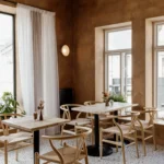
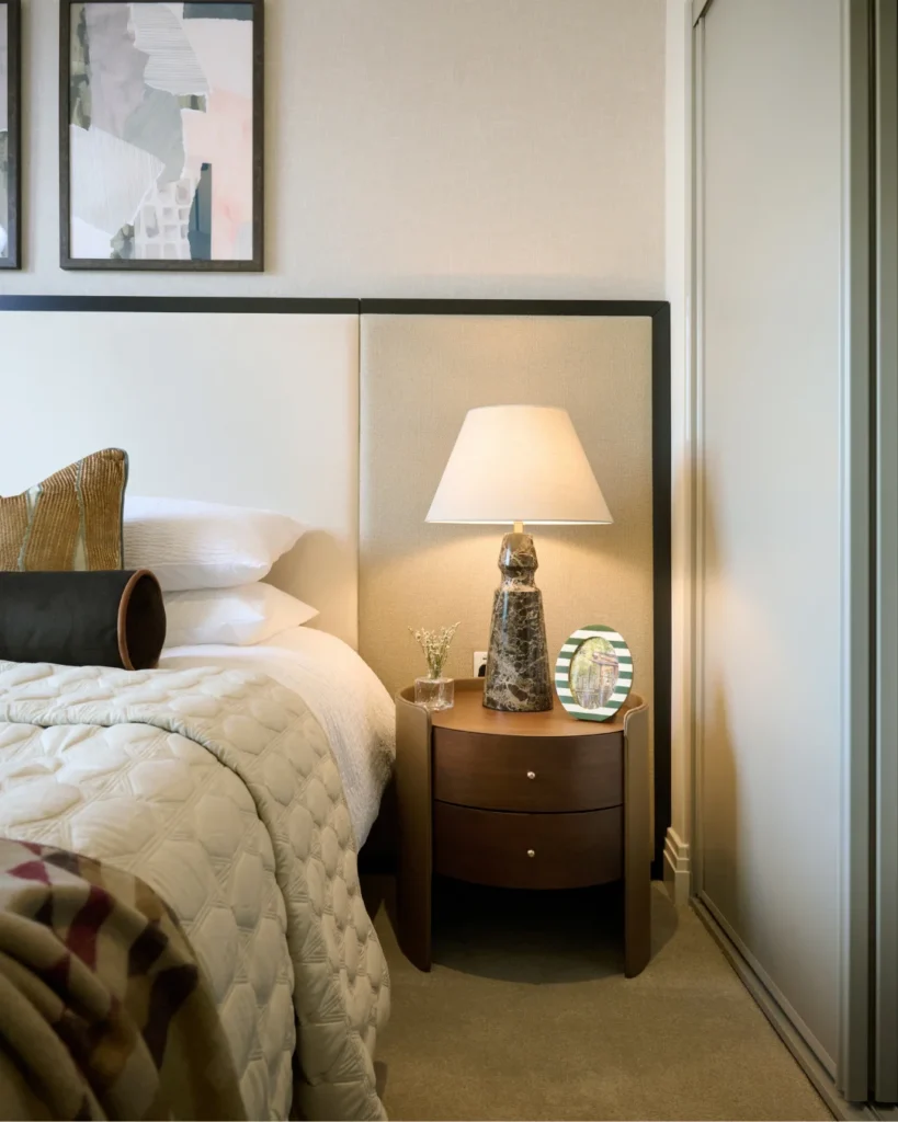
There is a reason that the colours of the natural world, soft ochres, warm taupes, earthy browns, dusty greens, feel so instinctively comfortable to live with. They are the tones our eyes have always found restful. They do not compete. They do not demand attention. They simply create an atmosphere that feels settled, considered, and calm.
This is particularly important in a home. Unlike a restaurant or a retail space, a home needs to work for every mood, every time of day, and every season. A palette built on warm, nature-inspired neutrals does this extraordinarily well, it recedes when you need the space to breathe, and comes alive when layered with texture, natural materials, and carefully chosen accents.
There is also a genuine wellbeing argument to be made. Colour has a profound effect on how we feel in a space. Cooler, starker tones can create a sense of clarity but also of tension. Warmer, earthier tones tend to do the opposite, they wrap around you. They encourage you to slow down. They make a room feel like somewhere you actually want to be.
Mixing neutrals with colour, without losing the calm
One of the questions we are asked most often is how to introduce colour into a home without it feeling overwhelming or at odds with the restful quality people are looking for. The answer, almost always, lies in the relationship between a warm neutral base and carefully chosen autumnal or nature-inspired accents.
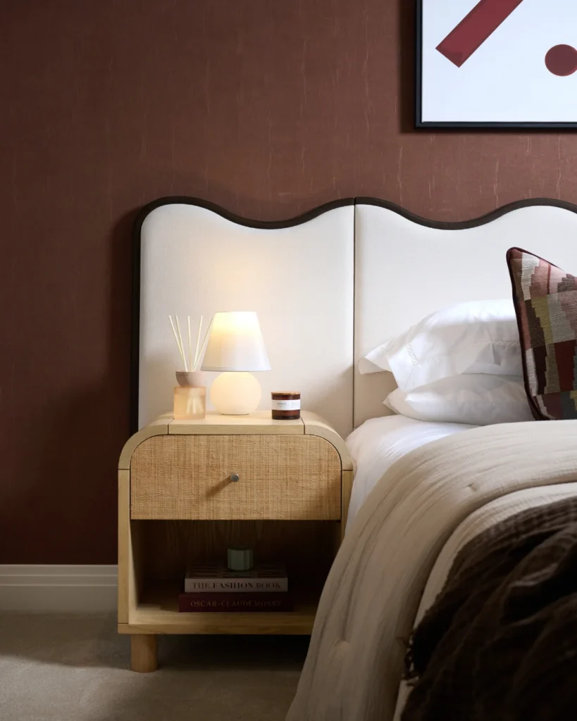
Think of the palette of an October walk. The soft greens of moss and foliage. The warm russet of fallen leaves. The deep brown of bark and earth. The muted gold of late afternoon light. None of these colours are loud or demanding, but together they create something rich, layered, and deeply satisfying. That same principle translates beautifully into interior design.
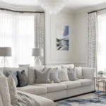
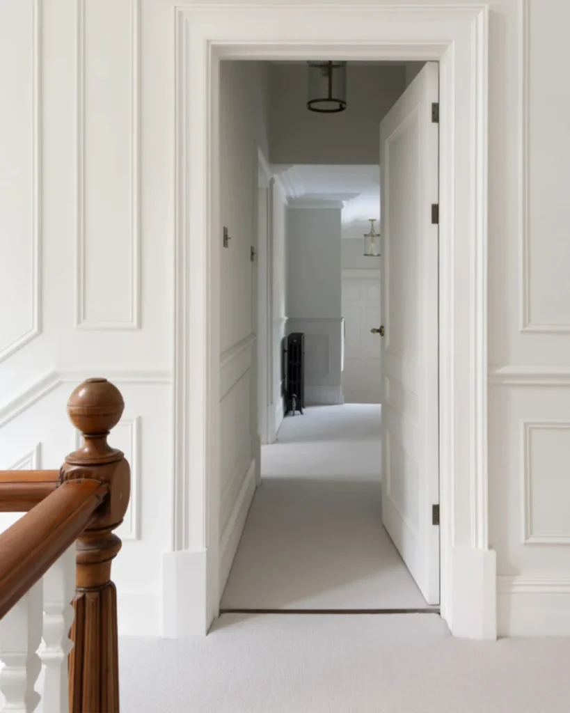
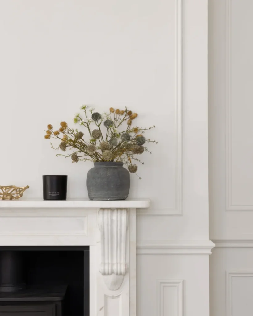
At our South Wales renovation project, we selected warm off-whites throughout to maximise the natural light and complement the original Victorian features. Rather than competing with the character of the property, the paint tones allowed the restored coving, panelling, and fireplaces to become the focus. The warmth within the paint tones helped soften the natural light, creating spaces that felt elegant yet welcoming, and demonstrating that colour can often bring something unexpected and beautiful to period homes.
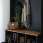
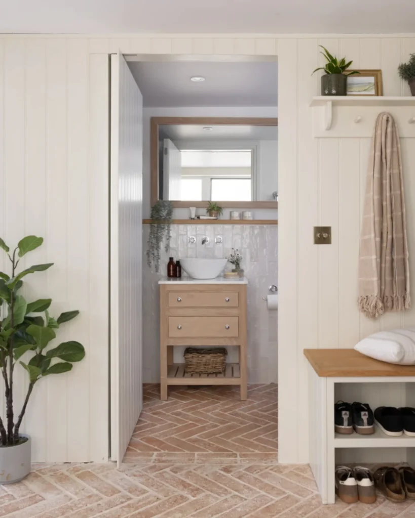
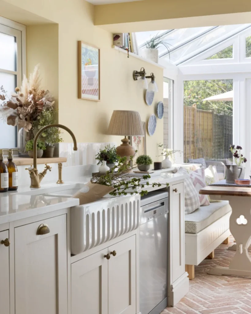
Within our Surrey cottage project, we leaned into muted yellows, soft creams, and earthy tones to create a home that felt cosy and comforting. These warmer tones worked beautifully alongside the natural textures and traditional elements throughout the property, the panelling, the brick, the worn flagstone, helping the interiors feel settled and timeless rather than styled and temporary.
The art of layering
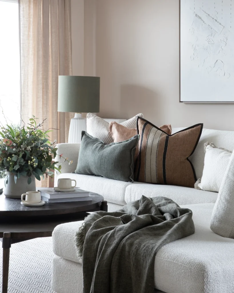
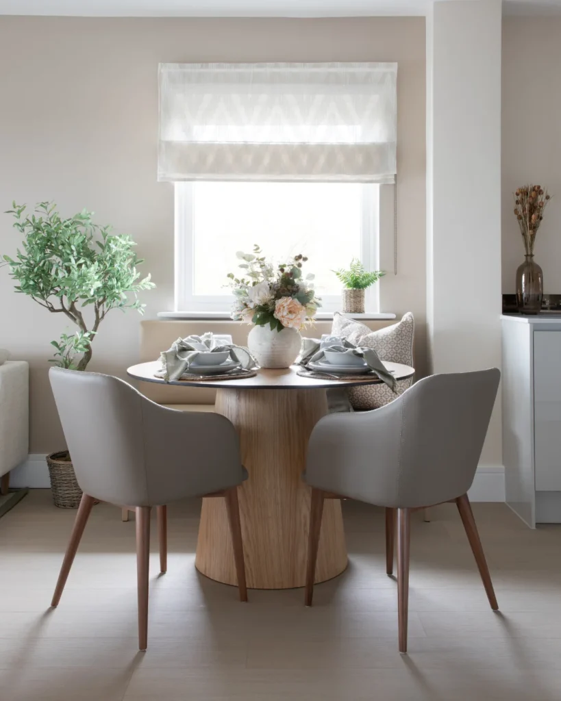
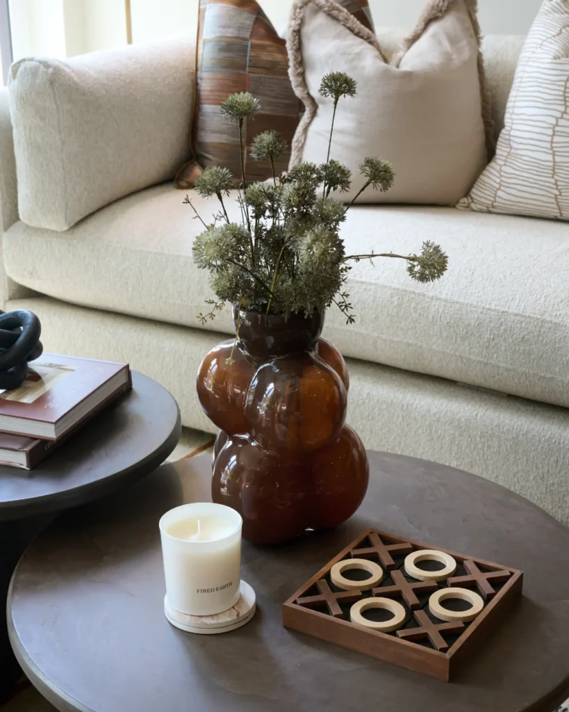
One of the most accessible ways to build a warm neutral palette, and one that the spaces we create demonstrate time and again, is through the layering of soft furnishings and textiles. Throws, cushions, curtains, and upholstery are the elements that give a neutral room its depth and warmth, and they offer a level of flexibility that paint and wallpaper simply cannot. A warm linen sofa paired with sage green cushions, a dusty pink throw, and curtains in a tonal stripe reads as considered and cohesive rather than colourful, because every element is drawn from the same quiet corner of the natural world. It is this kind of layering, built slowly and thoughtfully, that makes a neutral interior feel genuinely rich rather than simply pale.
The role of interior architecture
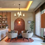
Warm neutrals do not exist in isolation. One of the things that distinguishes a truly considered use of colour from a simply pleasant one is how the palette works with the architecture of the space, the coving, the panelling, the joinery, the proportions of the rooms themselves.
This is where interior architecture becomes essential. When colour is chosen in response to the bones of a building, the way light enters a room, the height of a ceiling, the depth of a reveal, the material of a floor, it sits within the space rather than being applied to it. The difference between the two is immediately felt, even if it is not always consciously understood.
It is also why flow matters so much. Selecting similar warm neutrals across key areas of a home, hallways, landings, connecting spaces, creates a sense of continuity and calm that makes a home feel coherent rather than disconnected. Each room can have its own character and its own depth of tone, but the thread running through them should always be recognisable. Consistent. Considered.
A note on our own palette
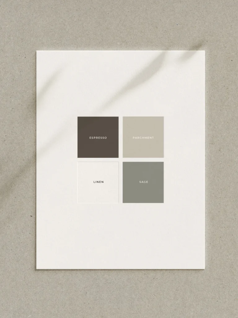
The colours at the heart of the Wells and Maguire brand, our Parchment, Linen, Sage, and Espresso, were chosen not because they were fashionable, but because they reflect exactly the qualities we value most in the interiors we create. Warmth, depth, a connection to natural materials, and a sense of calm that does not tip into coldness.
They are, in many ways, the distillation of everything we believe about colour, that the most enduring choices are not the boldest ones, but the ones that feel most at home in the world around them.
Where to start
If you are considering introducing warmer, earthier tones into your home, our advice is always the same, start with the light. Understand how natural light moves through your space throughout the day and across the seasons before committing to any colour. A tone that feels perfectly warm on a north-facing wall in summer can read very differently on a grey October morning.
From there, consider the architecture. What are you working with? What does the space want to be? And then build your palette from the ground up, neutral foundations first, layered with texture, natural materials, and carefully chosen accents that bring the warmth of the natural world indoors.
If you would like guidance on colour as part of a wider interior design project in Wales or across the UK, we would love to hear from you.
Living Made Beautiful.