In colour theory, blue is often associated with calm, clarity and trust – and when you think about where we see it in nature (the sky, sea, or water more generally), it’s easy to see why. It’s soothing, serene and feels both timeless and grounding… which is probably why it appears in so many of our projects!
That said, depending on the shade, blue can also feel deeply luxurious and make a bold statement. With that in mind, we wanted to shine a spotlight on one of our favourite colours and explore its versatility in more depth. Not to mention offer a little guidance on how to use blue effectively in your own home.
BLUE AS A CALMING NEUTRAL
More often than not, when clients come to us asking for a warm, neutral space, they initially assume that blue is too cold or too colourful for their tastes. But blue’s versatility is one of its greatest strengths, and part of our job is to find the right tone to suit the home and how it’s used.
In our opinion, many muted blues have enough depth to ground a space in the same way a classic neutral would. In our Kingston project, for instance, the stunning shade ‘Selvedge’ used in the formal living room feels calm, inviting and gives even the most sought-after neutrals a run for their money.
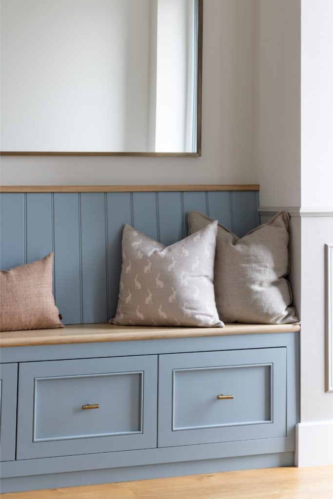
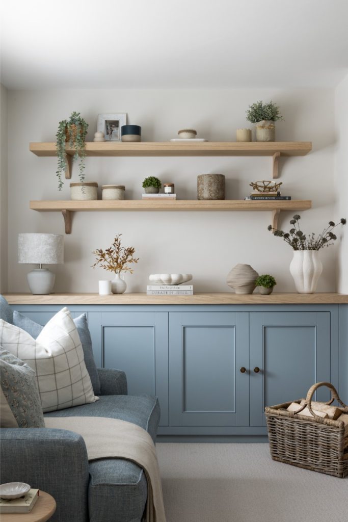
Dusty blues, slate tones or bluey greys all work beautifully. These shades are particularly effective on walls, cabinetry or upholstery, especially when paired with creams, woods or natural stone.


BLUE AS A STATEMENT
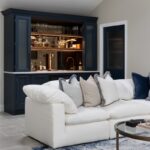
In contrast, you only have to look at our London City Apartment project to see how bold and impactful deeper blue/green tones can be. In colour theory, darker blues are associated with authority, intelligence and elegance, making them a brilliant choice for spaces where you want to inspire confidence or create a sense of luxury.
Think navy in a formal dining room, master suite or in a dramatic hallway where you want to make a first impression.
BLUE AS AN ACCENT COLOUR
We’ve had so much fun using blue as an accent colour over the years – from kitchen cabinetry to bespoke joinery and boot rooms. We tend to do this by pairing softer blues against a neutral backdrop, like in the living room of our Bristol Family Home or the statement free standing bath in our Surrey Family Home.

We’ve also used bold blues to great effect in two-tone kitchens – combining rich blue base units with soft stone wall cabinets, as we did in our Haslemere kitchen. In our opinion, the blue-and-white or blue-and-stone combination never goes out of style and feels fresh and versatile all year round.

BLUE AS AN ACCESSORY
The safest (but no less stylish) way to bring blue into your home is through accessories – a brilliant option if you’re unsure about committing to it on a larger scale.
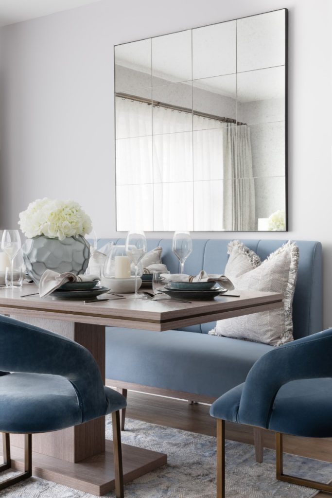
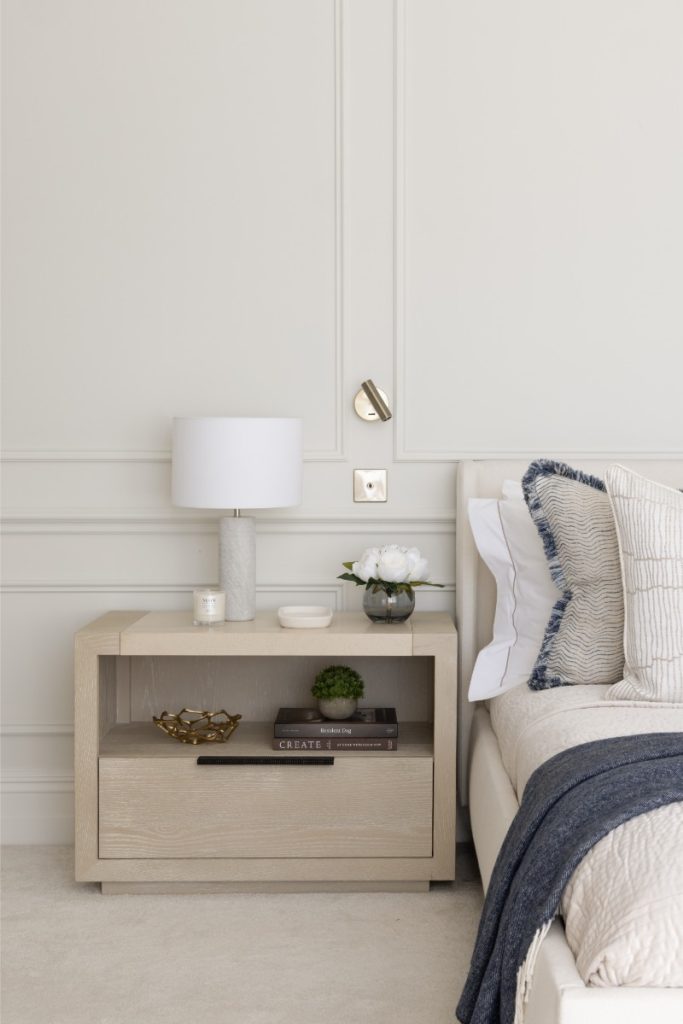
In our South Wales renovation, we used blue to add texture and depth to cushions in the master bedroom. In the kitchen-living area of our Kingston project, a rich navy sofa paired with lighter-toned cushions added a bold yet balanced pop of colour. We also opted for blue lamp bases and vases in the dining room, subtly tying the scheme together without overwhelming the space.

FINAL THOUGHTS
Essentially, if you’ve been toying with the idea of introducing blue into your home, we hope this post gives you the confidence to go for it. With so many shades and ways to incorporate it – from soft and subtle to bold and dramatic – blue truly is a colour that brings calm, character and timeless appeal.
Have specific questions about how to use it or what shade might work best? Feel free to contact us here.
For now though, have a lovely week and we’ll be back next month.
Emily and Danielle