Situated in South London, our clients had the good sense to see beyond the (extremely dated) aesthetics when they first viewed this detached Victorian home by the River Thames.
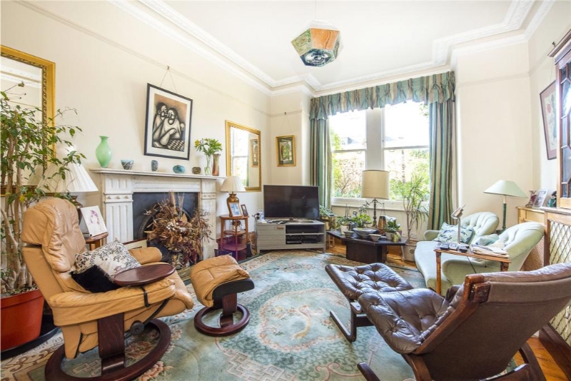
Think dark green entrance hall, brown carpets, walls ranging from magenta to bright yellow, and dated fabrics in clashing prints – and you’ll get a good idea of what they inherited when they first picked up the keys.
With stunning high ceilings, original features and so much space to work with though, it had the potential to be spectacular. And spectacular, it now is!
Admittedly, when our clients first reached out to us, they were already working with some great architects who had reconfigured the layout of the ground floor, opening up the space and letting more light in. Our job was to come in and transform the interiors into a beautiful family home. Working on the hallway, dining room, living room, kitchen-living space and playroom (situated in the attic), here’s an insight into what we chose to prioritise…
FROM CLASHING COLOURS TO CONTEMPORARY TONES
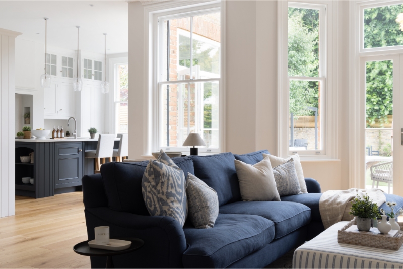
From the outset, our clients made their love for the colour blue clear — and we don’t blame them! It’s one of our favourites too. (So much so that we’ll be dedicating a blog post to why we love it in the coming months – watch this space!)
With that in mind, we set about creating a complementary palette that incorporated multiple shades of blue, paired with strong whites and contemporary neutrals to achieve a cohesive flow throughout the house.
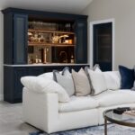
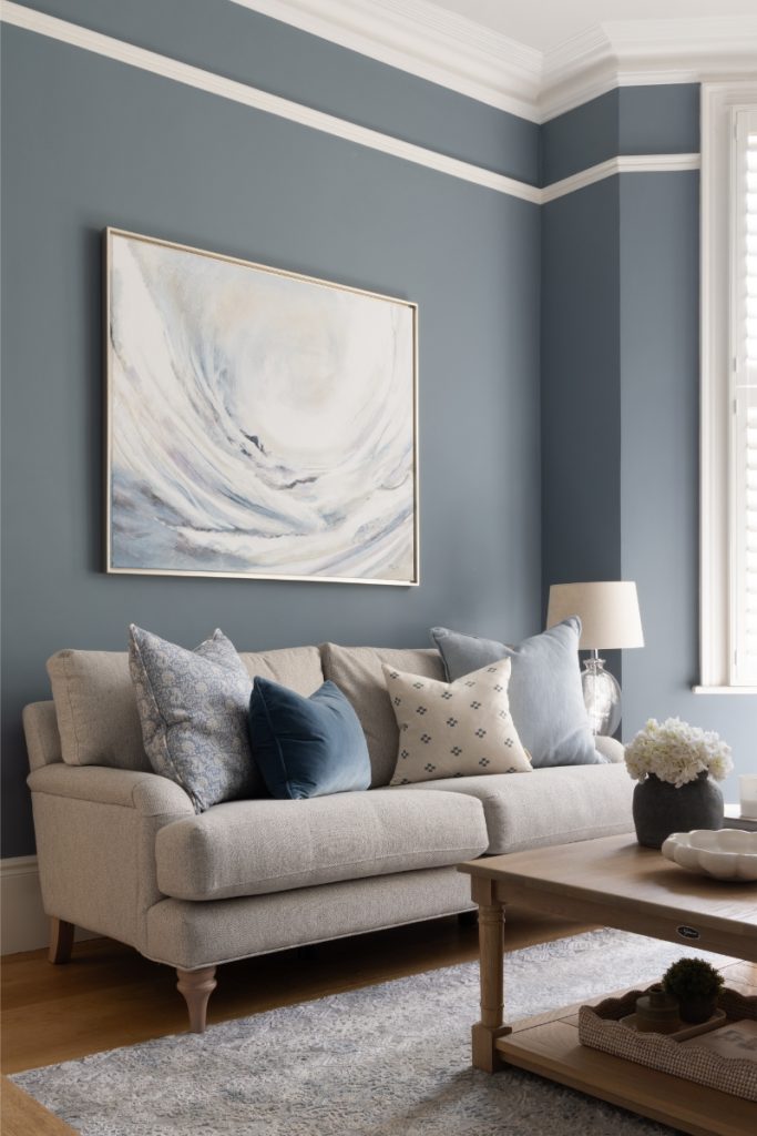
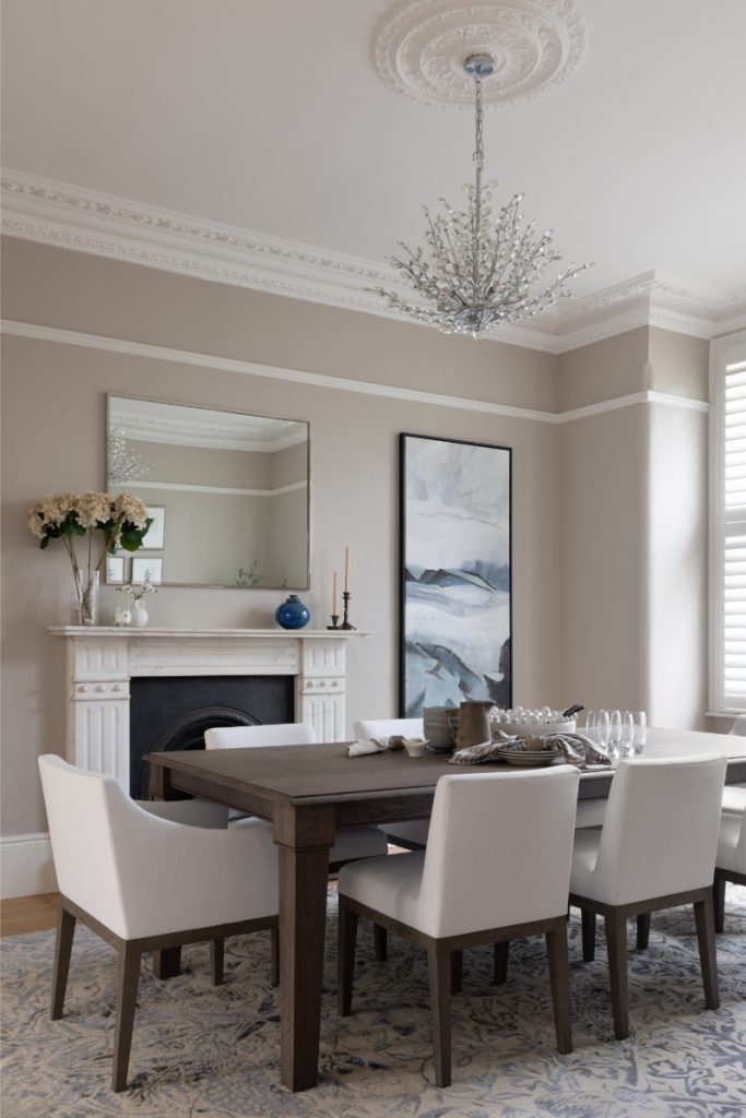
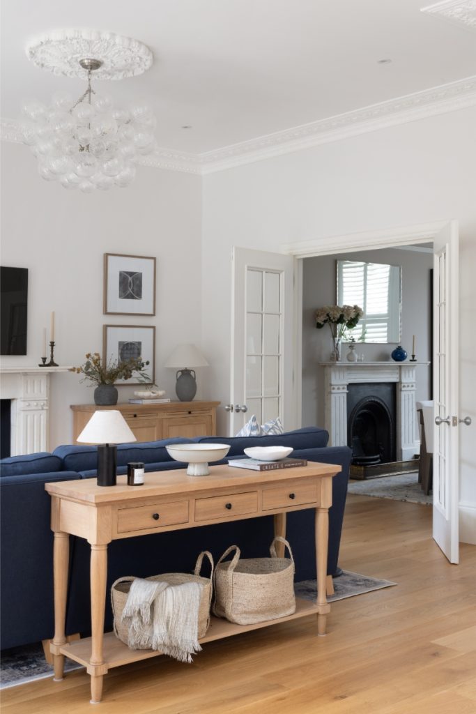
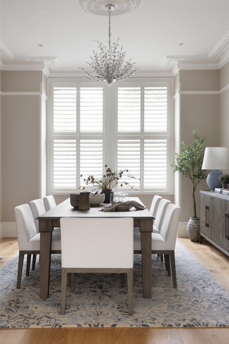
As you can see, this brief didn’t lead us to colour-drench every wall in blue to hit the mark. Instead, we were thoughtful about where the colour was introduced, ensuring that each room had its own identity. In the formal living room, a soft slate blue on the walls created a sense of warmth and maturity, contrasting beautifully with the pop of navy on the sofa and cupboards in the kitchen-living space. Meanwhile, the shade was introduced via accessories in the form of lamps and a vase in the dining area.

RETAINING NATURAL BEAUTY
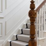
One of the best parts about working on Victorian properties is that they come with built-in character. For that reason, whilst we had no qualms painting over the dark wooden windowsills, stripping wallpaper and repainting every room, we made sure we didn’t just preserve the property’s original features – we thoughtfully incorporated them into our designs.
Naturally, this meant keeping the traditional fireplaces intact and using complementary tones on the walls to ensure the detailing on the mouldings and pilasters could be appreciated in all their glory.
PRIORITISING PRACTICALITY
Given that our clients have children, we were also tasked with ensuring the house wasn’t just beautiful, but practical for a busy family to live in. With that in mind, we added storage to most rooms, making use of the high ceilings in the kitchen and the nooks and crannies around the house so that toys and other everyday items could be tucked neatly away.
We also selected practical furniture and fabrics that wash easily and can handle everyday life.

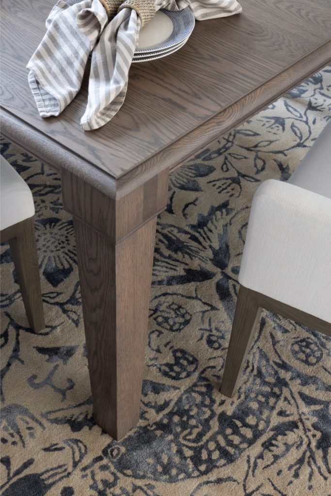
A MOMENT FOR THE DINING TABLE
We’ve mentioned in previous blog posts that our role includes furnishing homes, but sometimes our clients have a specific piece of furniture in mind that they’d love us to incorporate. In this case, it was a stunning dining table from Humphrey Munson. Handmade using traditional joinery techniques at their workshop in Felsted, Essex, it really is a work of art.
With that in mind, we designed the dining room around its beauty – and the results speak for themselves.
Our clients were also inspired by Studio McGee, Pottery Barn and Restoration Hardware, so furniture and accessories were selected with these design influences in mind.
FINAL THOUGHTS
We finished this project in the summer of 2024 but shot the imagery in June 2025 – and we can safely say it looked just as beautiful one year on.
In our eyes, when you compare the before and after shots, it really is a great example of why you should never judge a book by its cover. It also highlights how a blue-based palette can be both versatile and timeless.


If you’re looking for an interior designer for an upcoming project, feel free to contact us here.
For now though, we hope you’re having a beautiful summer and we’ll speak to you soon.
Emily and Danielle